


Of all the artists associated with West Coast art, Edward Ruscha is one of the best known. He was there at the birth Los Angeles’s postwar art scene, which sprang up in the late 1950s and early 1960s around a sprinkling of forward-looking galleries, including the Ferus Gallery. Ruscha had is solo debut there in 1963, going on to 60 years of artistic production that won him global acclaim and a spot as the U.S. representative at the 2005 Venice Biennale.
Ruscha’s current retrospective at the Museum of Modern Art testifies to his achievements. Co-organized by the Los Angeles County Museum of Art and on view through January 13, 2024, “Ed Ruscha/Now Then” offers a comprehensive overview of his multivalent practice, which includes painting, printmaking, drawing, bookmaking, and installation art. It reveals an artist with a cagey, deadpan sense of humor, whose focus on on the dialectic between reality and illusion eventually developed into a meditation on the American dream.
Throughout, Los Angeles, a city known for evanescent sunshine, movie magic, and all-pervasive freeways, remained Ruscha’s muse and touchstone, reflected in paintings and works on paper that are at once crisply delineated and mirage-like. Below, ARTnews revisits Ruscha’s life, art, and aesthetic vision through some of his best-known works.
Ruscha was born in Omaha in 1937. His father was an insurance adjustor, and his mother a housewife who encouraged Ruscha’s interest in art. At age four he relocated with his family to Oklahoma City where he grew up before moving to Los Angeles to study at the Chouinard Art Institute (known today as Cal Arts) in 1956. Ruscha graduated in 1960, and after travelling through Europe for seven months, took a job with a Los Angeles advertising agency. Much like Andy Warhol’s, Ruscha’s experience as a commercial artist would heavily impact his work. (So would his travels: Aside from his European sojourn, Ruscha had previously hitchhiked through the South while still in high school, a journey that would be recalled in some of his early pieces.)
Over the next couple of years, Ruscha fell in with the artists orbiting the Ferus Gallery, which opened in 1957 on La Cienega Boulevard in West Hollywood. Founded by the curator Walter Hopps, his wife Shirley Hopps, and the artist Edward Kienholz, Ferus quickly became the ground zero of Los Angeles art, hosting exhibitions by Kienholz and a roster of talents that included John Altoon, Larry Bell, Billy Al Bengston, Robert Irwin, John McCracken, and Ed Moses, as well as Ruscha. Stylistically they were a diverse lot whose efforts ranged across figuration, Expressionism and Minimalist abstraction and this was no less true of Ruscha’s output, which ran the gamut from Pop Art to conceptualism.
Ruscha’s paintings were initially received as a West Coast version of Pop Art, but while Ruscha did allude to so-called low culture, his interests diverged from artists in New York—Warhol, Roy Lichtenstein, James Rosenquist—who were doing the same. Influenced by Jasper Johns and René Magritte, Ruscha’s approach was largely text driven. Rather than portray the fruits of consumerism as iconographic representations of capitalism like his East Coast coevals, Ruscha often depicted ordinary nouns and verbs in the sorts of fonts found in advertising and magazines, taking them out of context to demonstrate how graphic design can drain language of its meaning. Ruscha frequently employed bright, contrasting colors both within and around his letterforms, making them leap from the canvas. Throughout his career, he would also infuse his efforts with a deadpan sense of humor.
OOF (1962) is probably the best-known of Ruscha’s word paintings, with its onomatopoeic subject painted a bright yellow against a deep blue backdrop in large, sans serif characters. “Oof” is, of course, the sound one makes when hit in the stomach. In print form it migrated out of comic books, but in Ruscha’s hands the phrase isn’t accompanied by an illustration (as in Lichtenstein’s Ben Day–dotted dogfight scene Whaam! from 1963); it’s simply left on its own, as bluntly present as an EXIT sign. As Ruscha himself put it in a 2013 New Yorker profile, “I like the idea of a word becoming a picture, almost leaving its body, then coming back and becoming a word again.”
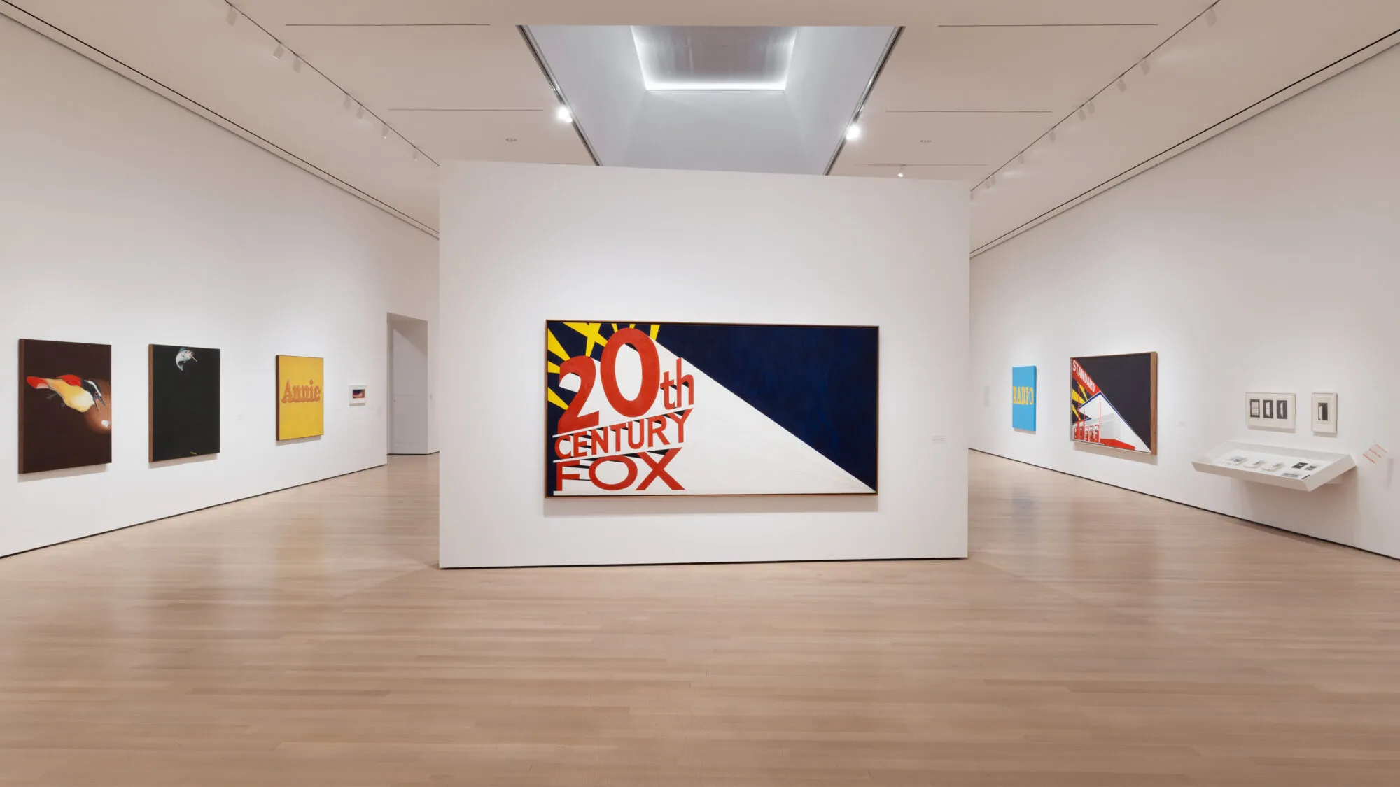
Ruscha did employ imagery, and sometimes (though more occasionally) brand names. Examples include Annie and Large Trademark with Eight Spotlights (both 1962), the first featuring the title of the comic strip starring a curly-haired, redheaded orphan and the second the famed emblem of the 20th Century Fox movie studio.
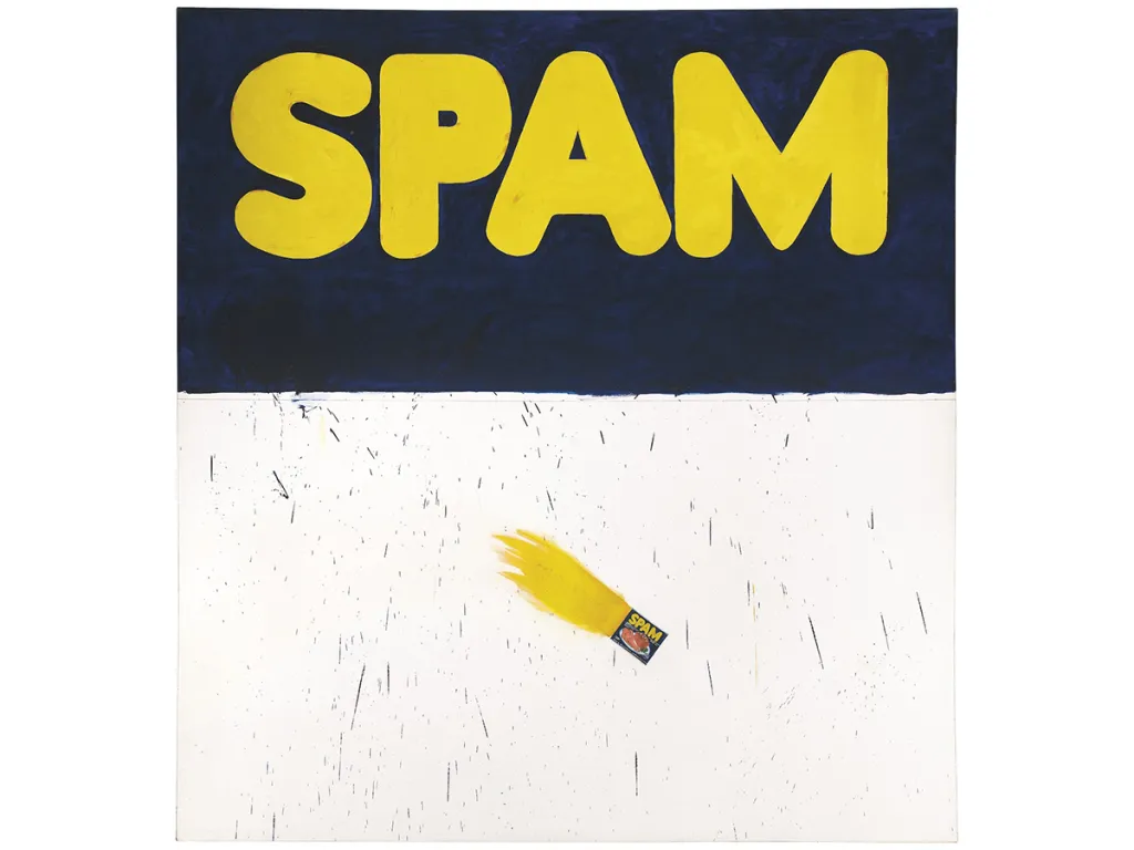
Actual Size (1962) is a tongue-in-cheek encomium to Spam, a potted-meat product that became popular in postwar America due to its ubiquity in the U.S. serviceman’s diet during World War II. Ruscha bannered the product’s logo across the top half of his large canvas, limning it—like OOF—in bright yellow against a blue ground. The lower half of the canvas is largely blank except for splatters and drips of paint, as well as a realistically depicted tin of Spam; per a penciled inscription on an explosive patch of yellow jetting from the small image like a comet’s tail (a gesture that also suggest the object being consumed by flames), the can has been rendered according to its real-life dimensions.
Both OOF and Actual Size were painted in relatively flat pigment, a departure from previous word paintings lettered in an impasto that was indebted to Johns’s use of encaustic paint. But Actual Size points to another key element in Ruscha’s approach: his employment of trompe l’oeil.
Trompe l’oeil depictions function in Ruscha’s work much like words do, “leaving [their] bodies” before “coming back and becoming” themselves again—a visual conundrum exposed in Magritte’s iconic The Treachery of Images (1929) with its image of a pipe that isn’t.
Ruscha’s engagement with the technique evolved from a series of works begun in the late 1950s that recall his teenage travels. In Box Smashed Flat (Vicksburg) from 1960–61, for example, the name of the eponymous Mississippi city is emblazoned in a Civil War–era typeface below an actual carton for Sun Maid Raisins—Ruscha’s preferred snack—flattened against the canvas. In two versions of a piece named for Dublin, Georgia, Ruscha made an explicit leap from collage to trompe l’oeil. The first, a small study on paper, comprised pieces of wood and a Sunday-paper cartoon in color (Little Orphan Annie again) pasted to the surface, while the second consisted of a large canvas realistically reprising the composition in oil.
Ruscha has described Noise, Pencil, Broken Pencil, Cheap Western (1963) as one of his best efforts. It consists of four trompe l’oeil images pushed to the edges of a canvas covered in a deep shade of ultramarine blue. At center top sits the word noise, depicted in the sharply receding orthogonal mode of the 20th Century Fox logo that appeared in Ruscha’s earlier work. The cover of a Western pulp-fiction magazine from the late 1940s, depicting a gun-toting sheriff in a red shirt, occupies center bottom, while two pencils aligned horizontally on opposite sides of the canvas poke the left and right edges of the composition about a third of the way from the top. One is whole while the other is broken, suggesting that the noise being referred to is the sound of a pencil snapping.
Given that such publications had mostly disappeared by the early 1960s, the Western dime novel represents, perhaps, the persistence of memory. Whatever its specific meaning, it is consistent with Ruscha’s tendency to refer to his life and surroundings, whether that involves his food preferences, his adventures, or Los Angeles itself.
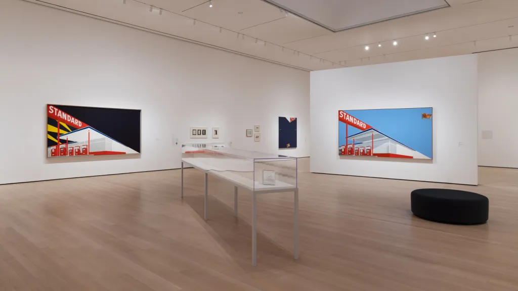
Standard Station, Amarillo, Texas (1963) (left) is another painting that grew out of Ruscha’s journeys. One of two takes on the image (the other being 1964’s Standard Station, Ten-Cent Western Being Torn in Half (right), which reprises the same object—now abused—from Noise), Standard Station plays once again on the typography of the 20th Century Fox logo, complete with the nighttime setting and searchlight beams of the latter. Standard Station elevates a quotidian locale to the status of landmark, and at roughly 5 by 10 feet, it also marks Ruscha’s use of the panoramic format that regularly appears in his work.
Trompe l’oeil is taken to a meta level in Angry Because It’s Plaster, Not Milk (1965), a depiction of a bird with a keeled-over glass that appears to contain milk but whose contents remain solidly in place. The painting recalls the legend of the ancient Greek painter Zeuxis, whose skills were such that birds pecked at his still lifes of grapes. The dismay they presumably experienced is made manifest in this humorous meditation on what is and isn’t real—a question that applies as much to this image as to Magritte’s celebrated pipe.
Ruscha was also known for a series of photography books begun in the early 1960s. Unsigned and cheaply printed, these, too, originated in Ruscha’s peregrinations, starting with Twentysix Gasoline Stations (1963), which comprised photos he’d taken during frequent road trips between Los Angeles and Oklahoma City. Once again the subjects were banal, but since one gas station is pretty much like the next, the images took on a serial quality that was more consistent with Conceptual Art than with conventional photography.
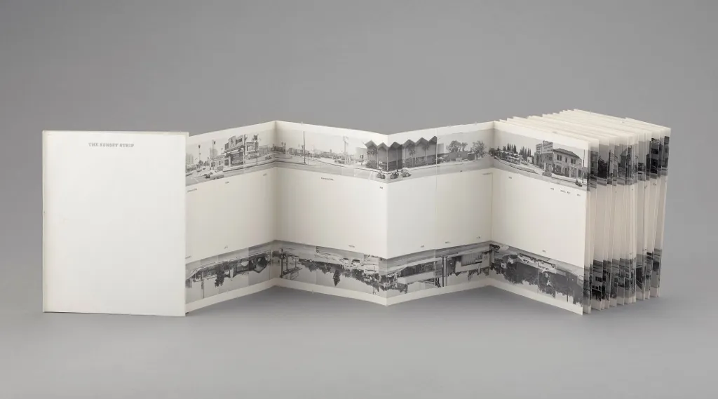
This became more apparent when Ruscha began to train his camera on Los Angeles in such volumes as Some Los Angeles Apartments (1965). For Every Building on the Sunset Strip (1966), Ruscha photographed both sides of the mile-and-a-half-long boulevard, publishing the images as an accordion foldout that stretched 25 feet. To capture his subject, Ruscha mounted a motorized camera on the back of a pickup truck; he likened the result to the flat facades found in Hollywood’s visualization of frontier towns. Cinematic yet non-narrative, Every Building evokes the echt L.A. experience of seeing life from a car. Perception and motion are made the same in a kind of Google Street View avant la lettre.
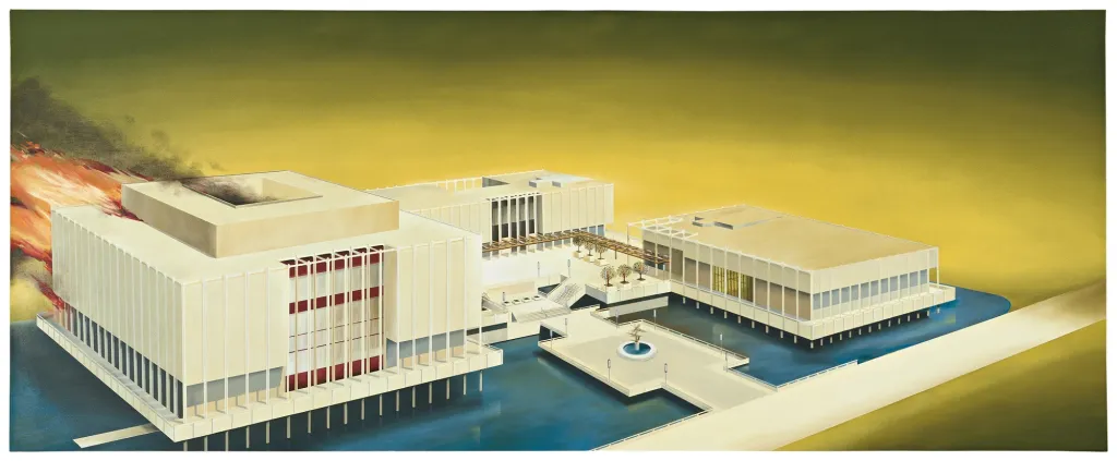
Well before climate change became a global concern, Los Angeles led a precarious existence, with regular earthquakes caused by a major fault line and brush fires enabled by dry desert winds. But if L.A. was an environmental cataclysm waiting to happen, its denizens faced the prospect with breezy hedonism. This context arguably informs Ruscha’s bird’s-eye perspective of the then newly opened Los Angeles County Museum of Art set ablaze. At the time, the painting was interpreted as being a negative comment on the building, a kind of baroque modernist acropolis designed by architect William Pereira. Ruscha, however, refuted this idea, saying that it was just a building he was interested in.
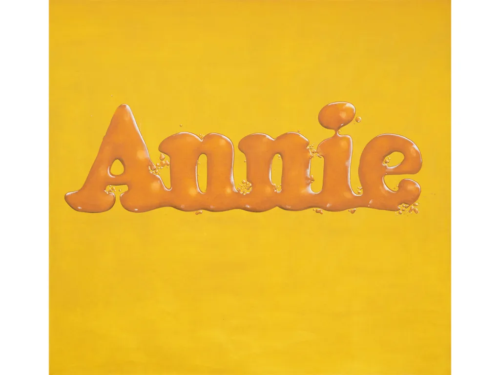
Two of Ruscha’s themes—the word as object and trompe l’oeil as a metaphor for the artifice of painting—combine in Annie, Poured from Maple Syrup (1966), which spells out the logo for Little Orphan Annie as puddles of amber goo against a yellow field and was the first of several compositions playing on words formed from liquids. Here, Ruscha’s reprises his earlier Annie, adding a surreal, even vaguely queasy-making twist that would become more apparent in 1969’s Adios, with its scatter of pinto beans suggesting vomit.
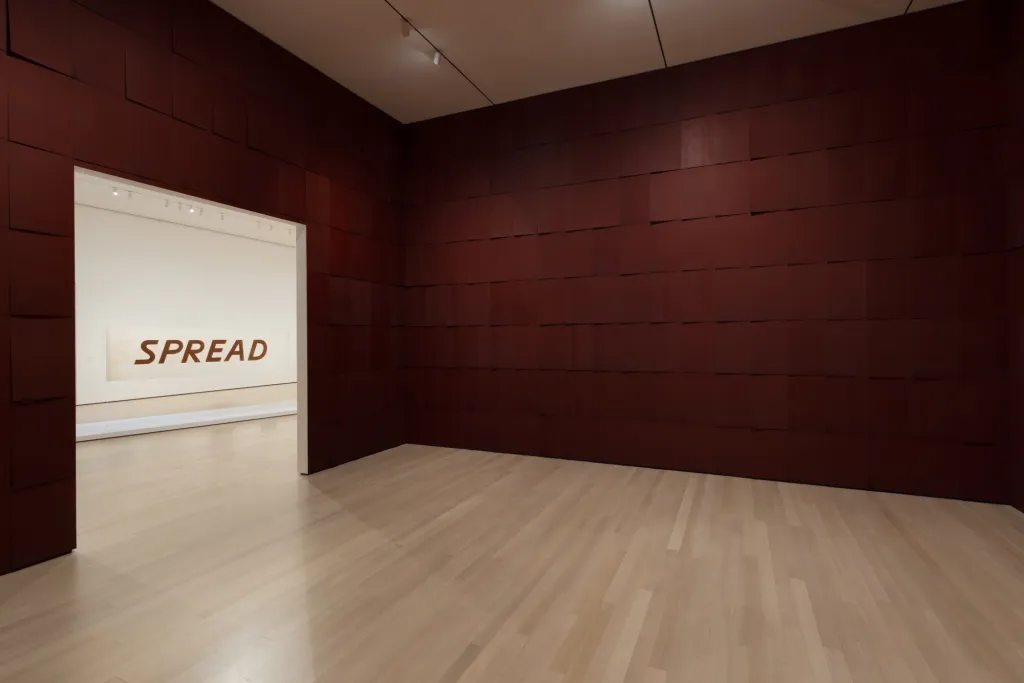
First mounted in Venice, Chocolate Room (1970)—Ruscha’s only installation—has been recreated on successive occasions, including his current retrospective at the Museum of Modern Art. The work comprises hundreds of pieces of paper, silkscreened in chocolate, tiled on the walls of a space. A combination of process art and minimalism, Chocolate Room is Ruscha’s most abstract work and arguably something of an outlier compared to the rest of his oeuvre.
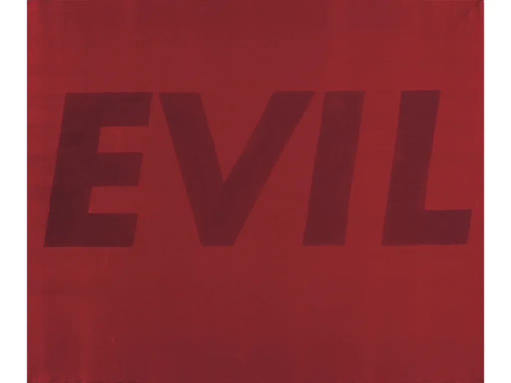
While Ruscha utilized an unconventional materialin Chocolate Room, it wasn’t the first time he had done so, nor would it be the last. Chocolate Room was a follow-up to several series employing unorthodox mediums, among them a portfolio of multiples called “News, Mews, Pews, Brews, Stews, Dues” (1970), in which the titular words were printed separately in an odd array of “organic” substances that included red salmon roe, Bolognese sauce, raw egg, squid ink, caviar, baked beans, chutney, daffodils, tulips, and axle grease. Following Chocolate Room, Ruscha began using substitute materials for canvas, such as satin and rayon, while adding gunpowder, egg yolks, and vanishing cream to his repertoire of materials. In the small (20-by-24-inch) painting Evil (1973), he went even further by using his own blood, a culmination, perhaps, of the abject themes he’d been toying with over the previous several years.